LearningFuze Redesign
A fresh take on the bootcamp’s outdated “JavaScript Prep Course” webpage
Problem
LearningFuze’s “JavaScript Prep Course” page suffers from a visually subpar interface and lack of clarity regarding the program’s structure.
Solution
Design an aesthetically refined webpage that informs prospective students with important information and entices them to enroll.
Team
Junior designer (me), senior designer, developer, 2 shareholders/project managers
Timeline
Dec 2023 - Jan 2024
Role
Research, design direction, wireframing
old page
Introductory Research
Who are the users?
Shareholders, alumni and current students
What kind of research is needed?
Shareholders were interviewed via Zoom to establish business needs, KPIs, constraints and deliverables.
Alumni and current students were interviewed via Zoom to learn first impressions and individual perspectives on the old webpage
Why were these questions asked?
To gain insights on:
User priorities (ex: curriculum, schedule, tuition, etc.)
User flow - How might a prospective student navigate the webpage?
Clarity of information - Does the copy need to be improved to better inform users?
snippet of a student’s responses
Interview questions were then synthesized through affinity mapping to reveal patterns.
“
Findings
1. 5 of 6 users reported that curriculum info was their primary concern.
This establishes the first step for our information architecture.
2. 4 of 6 users felt that the webpage was “too long”.
Aligning components in a consistent grid system reduces cognitive overload.
3. Nobody knew that the JavaScript Prep Course was a mandatory prerequisite.
3 of 5 users weren’t informed until attending the info session
My friend told me beforehand [that the JavaScript Prep Course was mandatory].
I didn’t know through the website.
-Tim Silva, 22
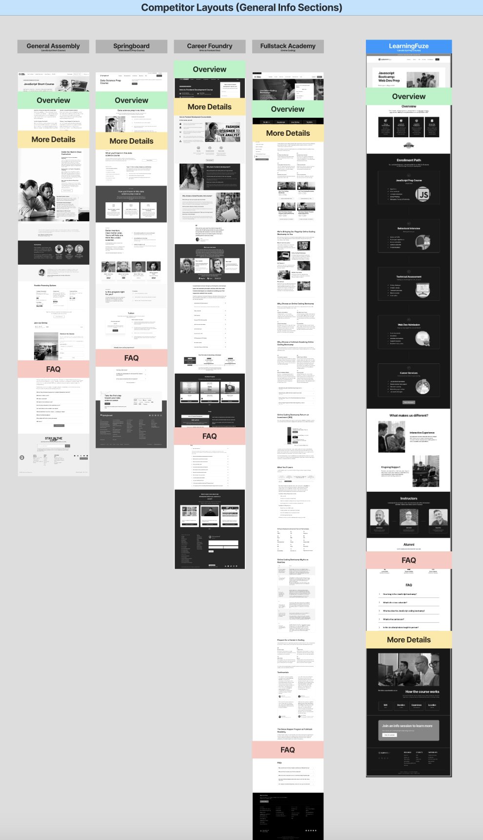
Competitor Analysis
In addition to learning about our user/business needs, we needed to supplement our research with evaluating visual and thematic trends found in our competitors’ websites. By doing so, we can establish which industry standards would be most advantageous to adopt in consideration of our unique user and business needs.
”
Wireframes
Ideating wireframes resulted with three variations to start from with consideration of coding complexity on the navigation bars and visual variety.
Mobile wireframes were drafted first in consideration of responsive design.
As design choices are communicated,
wireframes mature into mockups.
Usability Testing
After mockups are developed, a second round of testing takes place to refine usability. A key finding reveals a subtle inconsistency, creating confusion amongst 4 users.
The headers “Javascript Web Dev Prep” and “JavaScript Bootcamp” are referring to the same course. The introduction of the word “bootcamp” in the bottom section was an attempt to improve SEO, but this variation misled users to believe that these frames were referring to different programs. In order to remedy this, the new mockup deleted the “JavaScript Bootcamp” header altogether and restored consistency.
old mockup
new mockup
Results
LearningFuze’s old page webpage struggled with cognitive overload, visual appeal and fostering engagement. The research put into the WebDev Prep Course page’s revamp makes for a night and day difference. LearningFuze may have already translated these UI improvements to the rest of its website but future iterations are imminent as technology and user needs change.
old
new


