Randy Mark Auctioneer
How might we simplify the customer experience
for Randy Mark’s auction business?
Problem
Randy Mark, a car auctioneer from the Bronx, NY, needs a minimal but informative website to entice business.
Solution
Design a concise and visually clear website that prioritizes the pertinent information: auction schedules, locations and inventory.
Team
UX designer (me), 2 developers, 1 project manager
Timeline
Jan 2024 - Feb 2024
Role
Design direction, wireframing, mockups, UI design
Introductory Research
Research, in the form of interviewing the client for his MVPs, constraints, pain points and expectations, were already conducted by the stakeholder. The client wanted a no frills website that expressed his traditional values. This need contrasted with the urgency to provide auction info through a modern interface. Competitor research was conducted in order to supplement this scope.
Mood Board
Based off the client’s need for a modern yet traditional approach,
I brainstormed themes that embodied his vision: trustworthiness, minimalism, and modesty.
I chose Inter as my typeface because its balance of soft and simple curves evoked these three themes.
Color Palette
Branching off the mood board and onto colors, I began with adding a personal flair through selecting the Bronx flag colors: orange, white and blue.
Navy blue evokes trustworthiness and modesty while the orange not only adds a visual complement, but also provides a modern accent.
The warm grays act as the foundation for the website with concern for accessibility and minimalism.
Upon applying the chosen palette to my wireframes, the website began to lean towards too visually muted, so I punched up the saturation on the lighter blue and orange.
Wireframes
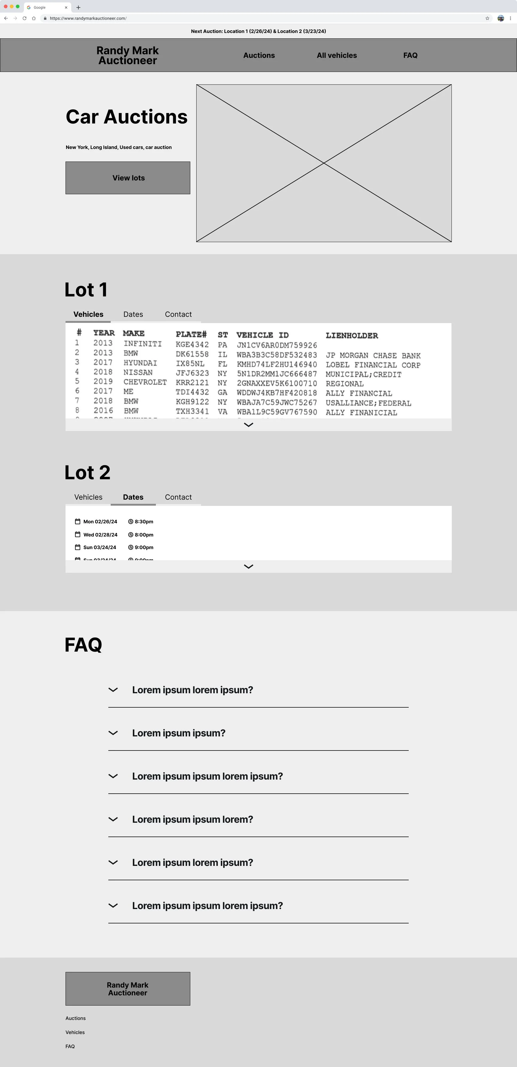
Ideating wireframes resulted with two variations to start from with consideration of coding complexity and visual variety.
This filter page was also created as a means to supplementing the inventory, but was later scrapped due to a shorter inventory and a more minimalistic approach.
The FAQ page allowed for experimentation on button and alignment varieties.
Results
The following mockups were presented as a solution to the client’s need for displaying concise information through a modern but modest lense.


